


7% More Completed Donations After Checkout Redesign
%20(1).png)
DonorSee, a global giving platform with over $10 million raised for people in need, increased completed donations by 7% and tip volume by 10% after a conversion audit by Conversion Haus identified two specific failure points in their checkout flow.
By Cian Condon | Conversion Haus | 2025
The Problem
A 34% abandonment rate between selecting a donation amount and completing payment is not a traffic problem or a product problem. It is a trust problem.
DonorSee's mission was clear. Their platform was trusted. But a significant percentage of donors who had already chosen an amount and committed to giving were dropping off right before payment was confirmed.
At the same time, tips represented only 2.95% of total donation volume.
For a platform that runs on the generosity of its community, that number pointed to a mechanic that was not working, not a donor base that was unwilling to give more.
What We Found
Two issues were creating the same outcome: donors losing confidence mid-transaction and leaving.
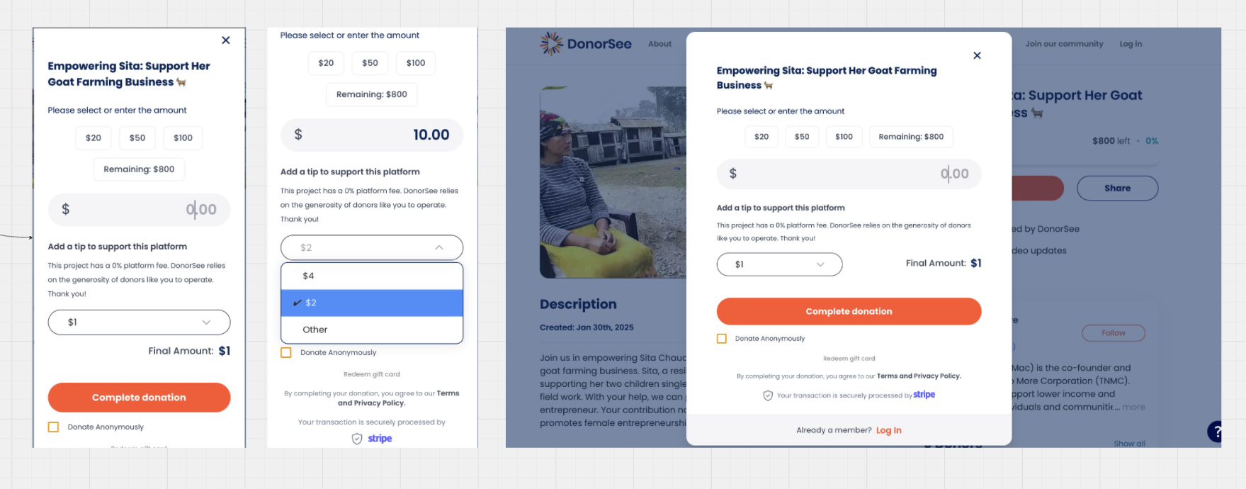
1. The tipping interface was a static dropdown.
It was difficult to adjust, gave donors no context for why tips mattered, and defaulted to an amount without explanation.
Donors either ignored it or spent time confused by it. Neither outcome helped completion rates.
2. The checkout screen was missing the trust signals that new donors rely on, particularly those unfamiliar with how DonorSee vets its projects and partners.
At the moment when a donor is about to hand over payment details, there was nothing on screen confirming that the platform was legitimate, secure, and accountable.
The combination of a friction-heavy tipping mechanic and an absence of trust signals at the point of commitment explained the drop-off.

What We Changed
We redesigned the donation flow with two main goals:
- Encourage more tips with a more a intuitive, easy to use slider, paired with persuasive, purpose-driven messaging.
- Increase trust and completion rates by integrating visible, trust signals at key moments in the journey.

Key Enhancements:
The dropdown was replaced with an interactive slider that defaults to 12% and updates the total in real time. Donors could now see their tip amount and the new total as they adjusted.
A short line of copy explained what the tip funded directly: sharing more life-changing stories and supporting vetted nonprofits. If a donor moved the slider to zero, a gentle prompt appeared rather than silent acceptance.
But the second improvement was really what made the difference.
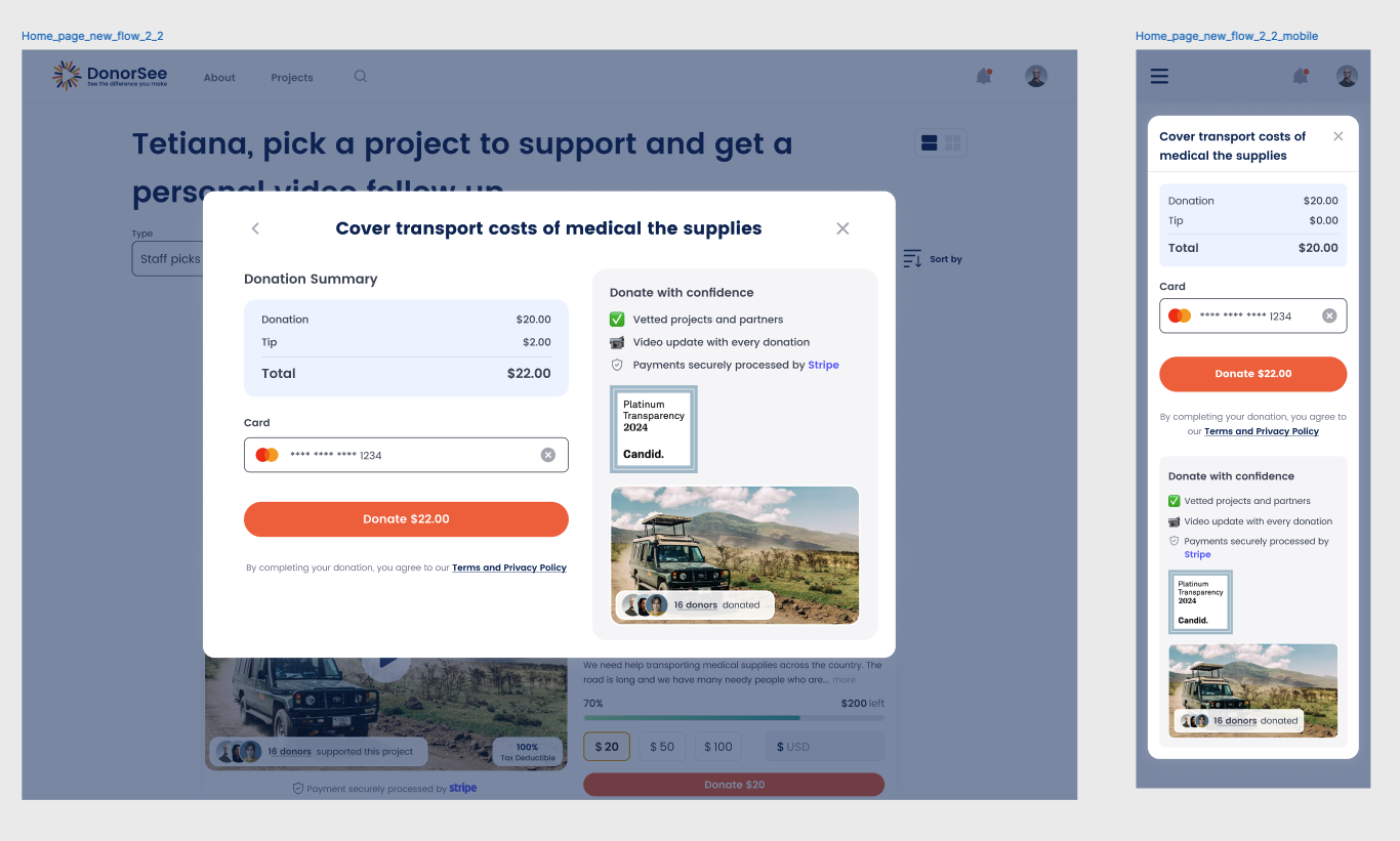
A new section of the checkout screen was added around a single heading: "Donate with Confidence."
It reinforced trust right at the moment donors needed it. Vetted projects and partners. Video updates for every donation. Secure payments through Stripe.
The modal was rebuilt to show a clear summary of donation, tip, and total before transitioning to payment. Logged-in and guest users both moved through the same confidence-building sequence.
Every change addressed a specific finding from the audit. Nothing was aesthetic.
Results
Tracked across DonorSee's web platform after launch:
7% increase in completed donations.
10% increase in average tip amount.
8% uplift in total donation volume.
The tipping mechanic went from a source of confusion to a default part of the transaction. The trust section gave new donors the confirmation they needed at the moment they needed it most.
The same conversion audit framework that identified the sequencing flaw in 2022 found a different set of failure points in 2025. Different diagnosis, same principle: find where the flow breaks down and fix that specific thing.
Related Work

Uncovered $1.4M in Recoverable Revenue — Terra Nova
Audit & Sprint

A Chatbot Became Their #1 Lead Source - Pods4U
Website Design & Conversion Optimisation
Stop wasting money on a leaking funnel.
Conversion audits
find & fix conversion leaks
CONVERSION HAUS
Sydney
.png)


